Chart Guide
Understand every part of our analysis at a glance.
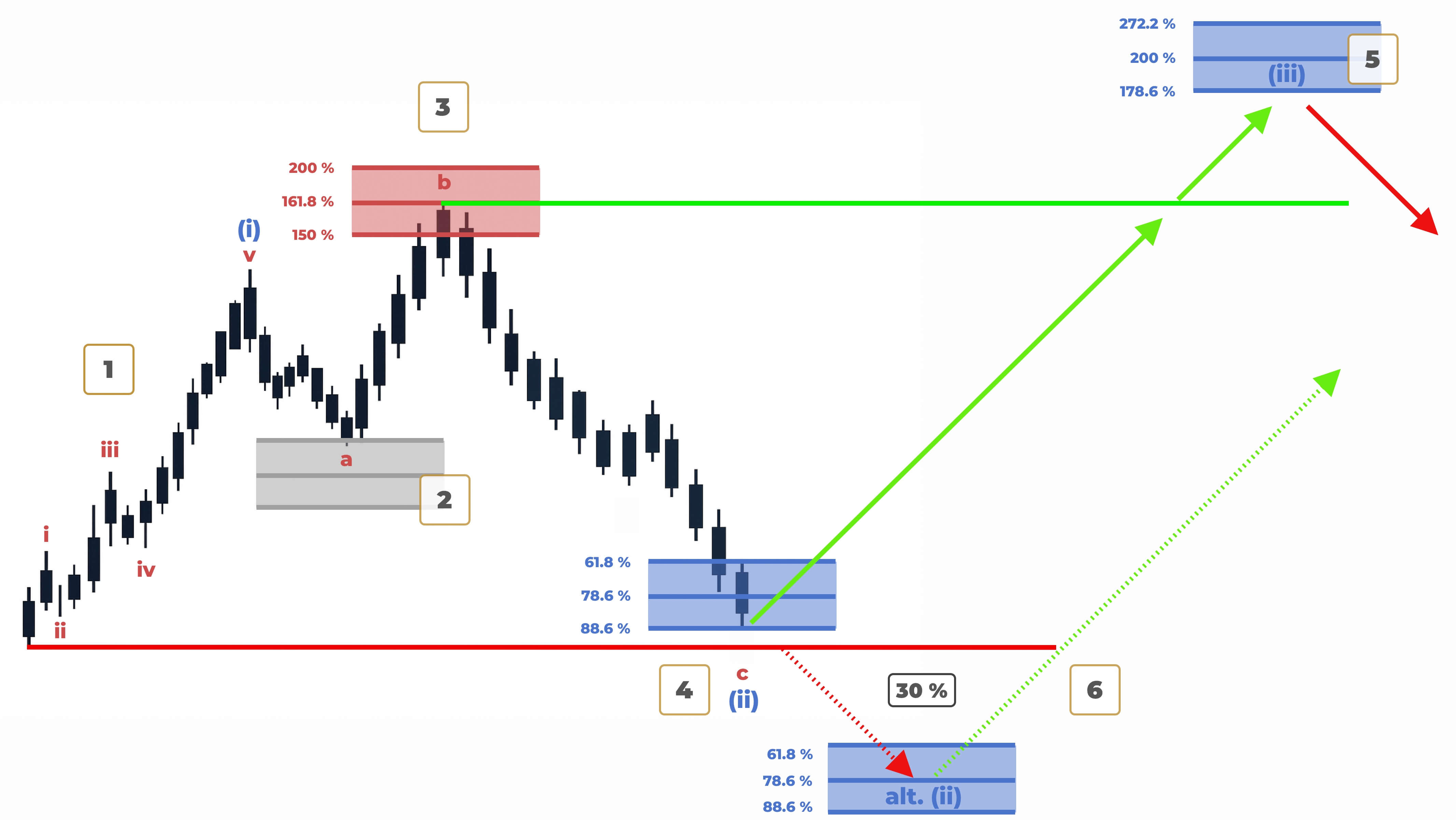
1 – Wave Analysis
Markets move in patterns — like waves. We use Elliott Wave analysis to track those patterns. Numbers show the main move, Letters show the pullback. Shaded colors tell you the strength of the move.
2 – Played Out Zone
This grey area was a previous setup. Price already reacted here, meaning the move is finished. We leave it visible for transparency and to show the history of the analysis.
3 – Local Target
The red zone marks a short-term reversal area. When price enters here, we look for immediate reactions. It helps catching precise moves within a larger trend.
4 – Major Investment Zone
The blue zone is where big trends are born. These are high-timeframe reversal areas. They offer the strongest setups for long-term investors with clear structure.
5 – Primary Setup
The filled arrow shows the most likely direction based on our analysis. It is our roadmap for the coming move reaching the target zones.
6 – Alternate Path
The dashed arrow is our backup plan. If key levels break, this is the path the market might take. We always stay prepared for both scenarios.
No more second-guessing.
Clarity beats chaos.
Choose your plan and get your first update today.
Start Now